How To Customize Label Cloud in Blogger With CSS3 Effects
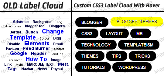
The Default Label Cloud Widget for Blogger Platform has a quite old
look. Since, we are in the days of CSS3. Therefore, we have to apply
latest techniques. Consider the Following screenshot to see the Label
Clouds i.e. the Default one and the Customized one.
Each Label Cloud Link is well kept under <a class/> that allows us
to customize each and every Label link cleanly. We have also assigned a
font size, so it does not overlap the pre-existing Default StyleSheet.
Our custom design would override the CSS. Thus, it would give an entire
new look.
How To Customize Label Cloud with CSS3?
The steps mentioned below are fairly straightforward and would hardly
take few minutes to complete. Consider the following instructions as
mentioned below.
- Go To Blogger.com >> Your Site >> Add a Gadget >> Label.
- Now match the settings which are shown in the screenshot below.
- Select the Cloud from the Display settings.
- Uncheck the Show number of post per label.
Now go ahead and Save the widget and that’s it we have successfully integrated a Label Cloud widget.
Customizing and Stylizing Blogger Label Cloud Widget:
- Once again go to Blogger >> Template >> (Create a backup in case anything went wrong).
- Select Edit HTML >> Proceed.
- Now with in the Template Search for ]]></b:skin> (CTRL+F Shortcut to quick search) and just above it paste the following CSS Coding.
/*--- MBL Custom Label Cloud With CSS3 --- */
.Label a{
padding-left:20px;
background:#000;
padding:0 20px;
color:#fff!important;
border-radius:100px;
-moz-border-radius:100px;
height:32px;
line-height:32px;
text-transform:uppercase;
text-decoration:none;
border:none !important;
-webkit-transition:all .3s ease-in-out !important;t: 30pxt: 30px;
float:left;
margin-left:5px;
margin-top:5px;
font-size:14px; }
.Label a:hover{
color:#000 !important;
background:#ff0; }
To Change the Hover Color Replace #ff0; with any color according to the desire needs.
To increase/decrease the font size replace 14px according to your needs.
All Done: After customizing save the template. Go a head and
check out your website and we are sure that you would love the
modification that we have made in the Label Cloud. Feel free to leave
your comments and suggestions.
From The Editor's Desk:
Hope everyone has enjoyed this small modification. Now everyone can
sense that a Small Chunk of CSS3 has the charm to spice up a website.
Its just a starting to this week because we have some awe-inspiring
widgets coming up. What are your thoughts about it. Suggestions would be
more then welcome. Take a lot care till then, Peace, blessings and
happy stylizing.


No comments:
Post a Comment